Showing posts with label SF. Show all posts

Tuesday, June 13, 2017

IMC- Day 1

- by Scott Fischer


Some behind the scenes action from day one of IMC 2017. www.artimc.org


IMC is quite possibly the most intense and awesome week of the year for many involved. I've had the privilege of being a core faculty member of the IMC for the past 10 years along with Boris Vallejo, Julie Bell, Donato Giancola, Dan Dos Santos, Greg Manchess, Irene Gallo and our founder. Our beating heart. Our true north, Rebecca Leveille Guay.


Special artist instructors this year are the kick-ass Andrew Hem, that art-wizard named John Jude Palencar, and the fabulous Cynthia Sheppard, who brings a full-circle moment for all of us. For once upon a time, before she was the Spectrum Gold medalist. Before she became an Art Director for Magic the Gathering- she was an attendee here at IMC. (Though honestly she was well on her way before she walked through our doors.)


It is an honor return to the beautiful campus of Amherst college annually, to help guide such a talented and driven group of artists. (I only wish there had been something like this when I was a student!)


The question is, how much info can you cram in your brain before it starts leaking out of your ears?


Day one starts off with a bang, a slide-show avalanche of art, showcasing every faculty member.  I am constantly inspired by my peers- but before we could catch our breath, we rolled right into a lecture on composition by the multi-figure master, Donato Giancola. A composition means nothing without emotional intent, which Rebecca covers by elegantly discussing the difference between "Predictable and Unpredictable Choices". This year Dan Dos Santos brought it home with a fabulous lecture on using value to tie your composition and emotional intent together. (Other years you may have heard Greg Manchess talk about composition and setting the stage, or myself talking about finding flow in your paintings.)


Next up is lunch at the Amherst College cafeteria. (My college never served Talapia and Chicken Masala!) If you are here, I don't know if your belly or your brain is digesting more, but there is no time to think about it, because it is time for action.


Day one feels like the longest day at IMC. It is sketch crit day. What follows is a sampling of what goes down.


Cynthia Sheppard, dos Santos and myself are one sketch crit-group. But you will find a similar frenzy of ideas and suggestions in any of the 5 groups.  First we look at some samples of your finished work to see where you are coming from, like this wonderful sampling by Mariah Tekulve.


If you brought traditional sketches they go up on the chalkboard and we start drawing on top of them and on the chalkboard itself. Here on Alice Herring's work. Sometimes the three of us drawing at the same time. Correcting composition, intent and value structure. (Sounds familiar.)


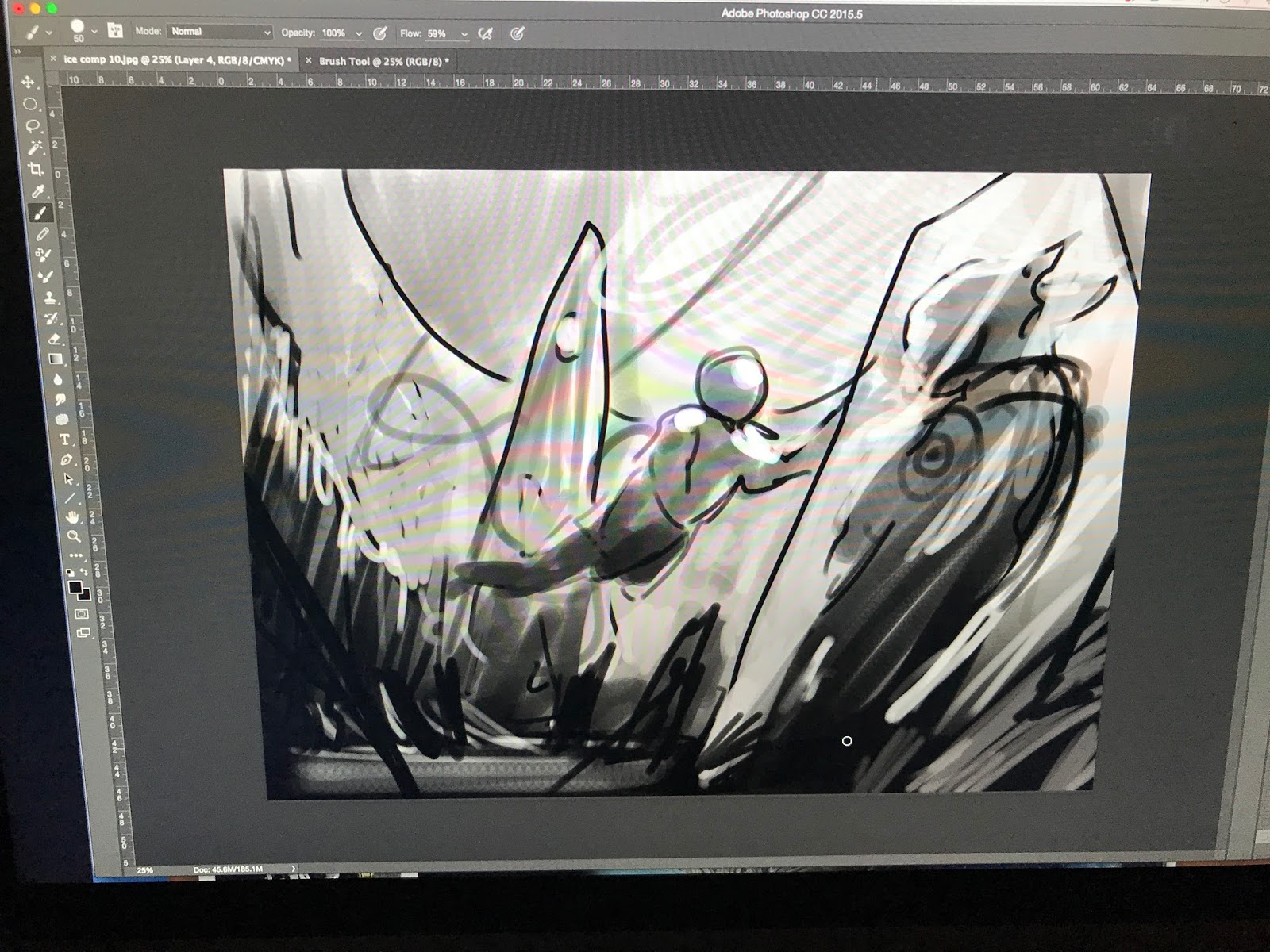
If you are pure digital, your work goes in photoshop on my Cintiq and is projected on the wall for everyone to see. There is almost a tug-of-war that happens with that poor stylus as Cynthia, dos Santos, and I are all itching to get the thoughts out of our head and into yours. "Who is the star of your painting?" "What is this pose telling us about the character?" "Every element should be considered and should be aiding your intent." "Look for the hidden rivers of energy in your piece." Cynthia suggested a great head flip in this zombie piece by Joel Hustak. And one of the most important, and hardest to answer, "What is it you want to do with your art."


The hope is, when we are finished critiquing your sketch, you are seeing your piece in a new light, and are ready for MORE drawing, drawing, drawing.


Here is a great before and after crit by dos Santos on Shonn Everette.


And after 5 hours of crits, it is time to fill your belly again, caffeinate, and come back for MORE lectures on shooting photo ref by dos Santos (to help inform your new sketches).


...and then how to mix and paint flesh by Donato Giancola. (Hint it is more involved than a tube of this!)


Finally everyone returns to their own easels and desks and they continue to, you know, DRAW, DRAW, DRAW!


And just think, 6 days to go!!!


Tuesday, May 16, 2017

If It Sucks, Do It Again


-By Scott Fischer


Sounds simple, right? If something is wrong, make it right. But lets be honest. Sometimes as artists we kinda suspect an area of our painting isn't as good as it could be. Maybe we don't know how to fix it? Maybe we show it to some folks, and hope they wont notice. And if they don't notice, we are like, "Sweet, fork that shiz because it is done!"


And if they do notice, we are like the kid caught with melted chocolate on his hands before dinner.


When a painting or even a sketch for a client has already been approved, it is sometimes tougher for us to act on our instincts to improve a piece. Even if you know it could be better. I ran into this in my early days of illustrating. There would be a poorly drawn hand in the approved sketch, and I felt tethered to that crappy drawing, like they would get mad at me if I made it better. Sounds crazy when I type that, but man those approved sketches felt like hand cuffs. But eventually I just made it better, and you know what, most times they didn't even notice. But I noticed.


We all make mistakes. We won't catch them all. (And it helps to have a bad-ass critique group that can catch the mistakes we missed.)


So here are a couple of my re-dos.


(Disclaimer- I don't claim to be the king of likenesses. They are tough. Even if you trace a likeness it can be tough to capture it. My hope is to get it close enough that when the title is blasted over it we have no doubt who the character is, lol. But I do my best, even if it means redoing it.)


This was the final art for Angel & Faith issue 5 (season 10). It was approved as you see it.


It didn't totally suck, I like a lot about this one. One of my favorites in many ways. Except dude, Angel is such a blubbering baby in this version.


Get that lil guy a diaper and a warm baby-bottle STAT. (Full of blood of course. (The bottle you sickos.)) I mean I get it, Angel is a 'Weight of the World' player most of the time, but come on. Try to get a little bad-ass back in there.


This was oil and acrylic on Duralar, already done and approved. Traditional art. A pain to fix. So what did I do? I attacked it with nail polish remover and redid it.


That felt better... Fork it!


It isn't the only time it has happened to our favorite brooding blood-sucker. Somehow he got a bit too much Alec Baldwin in Angel issue 3 (Season 11). Again, traditional art. Pain to fix. Out came the nail polish remover.


I grabbed a little vid of the destruction and reconstruction...


Fork it.


Both of these were self imposed changes. On work that was already finished and approved.


It is about taking ownership of the work. I reached a point in my career where suddenly I wanted the art to be improved FOR ME. Not just for the client. And my stamp of approval on my work became as important as the client's approval. I think we need to be selfish like that to make our best art.

Thursday, April 6, 2017

Dude, How Do You Illustrate For So Many Genres?


-By Scott Fischer


To celebrate the launch of my new website this week (thanks to my partner in all things, Teresa N Fischer!) I thought I'd talk a bit about the many artistic-hats I wear. (In case you too want to try them on.)


Pour a cup of tea or coffee or something stronger, sit back,  and click here to see the new digs: https://www.scottmfischer.com/


If you are like me, you like to draw lots of stuff, right? You love fantasy art, fine art, children's books, concept design, comic books/manga? So do I.


You've been told, "In order to succeed in illustration, you need to need to have a consistent voice, stick to ONE thing, one genre, one style." Dudes, what a creativity killer. Artistic hand-cuffs. Yup, I've heard that one more than a few times. Hell I've even told myself that. (But like a tweaked out technique-junky I told myself to shut the hell up. I couldn't be stopped.)


If you know my body of work, you may have even said to your well meaning peers, "But Scott does lots of different styles. Why can't I?" This is true, I've worked in everything from picture books to middle grade fiction, all the way to serious sci-fi/Fantasy, and these days, I am even dipping a toe in the gallery world.


'Rabbit Moon' - Oil on hand engraved copper.


It is no surprise then that the first question a student asks of me is often, "Fischer, how the frip-frackin-freck do you get to work on this abundant cornucopia of creativity?".


I hate to tell you this... and I wince at the look of disappointment on your familiar, multi-faceted-artist face when I say- "The folks who said 'Do one thing!' Well, they are kinda right."


Cause folks, the reality is: I did ONE thing for TEN years, first! 


Now I know 10 years sounds like a long time to many of you, but let me tell you, it will evaporate in an instant when you are on the other side of it. And as a result of focusing, you will have a foundation on which you can build-up, and more importantly, build OUT from.


The amazing Rick Berry (http://rickberrystudio.com/) once said to a younger me, "Scott, a career is like having one foot on a train that is going faster and faster down the track as you build reputation and prestige. But as soon as you have your footing, try to get a toe on another train on a different track, so that when the first train inevitably crashes violently into a wall, you can hop over to the second train without walking all the way back to the station and starting over from zero."


The lesson hit home, and as soon as I felt a platform beneath, that I was pretty sure I could return too, I leapt to another. Always trying to keep a hand in what came before.


Some pointers for the split art-personalities among you:


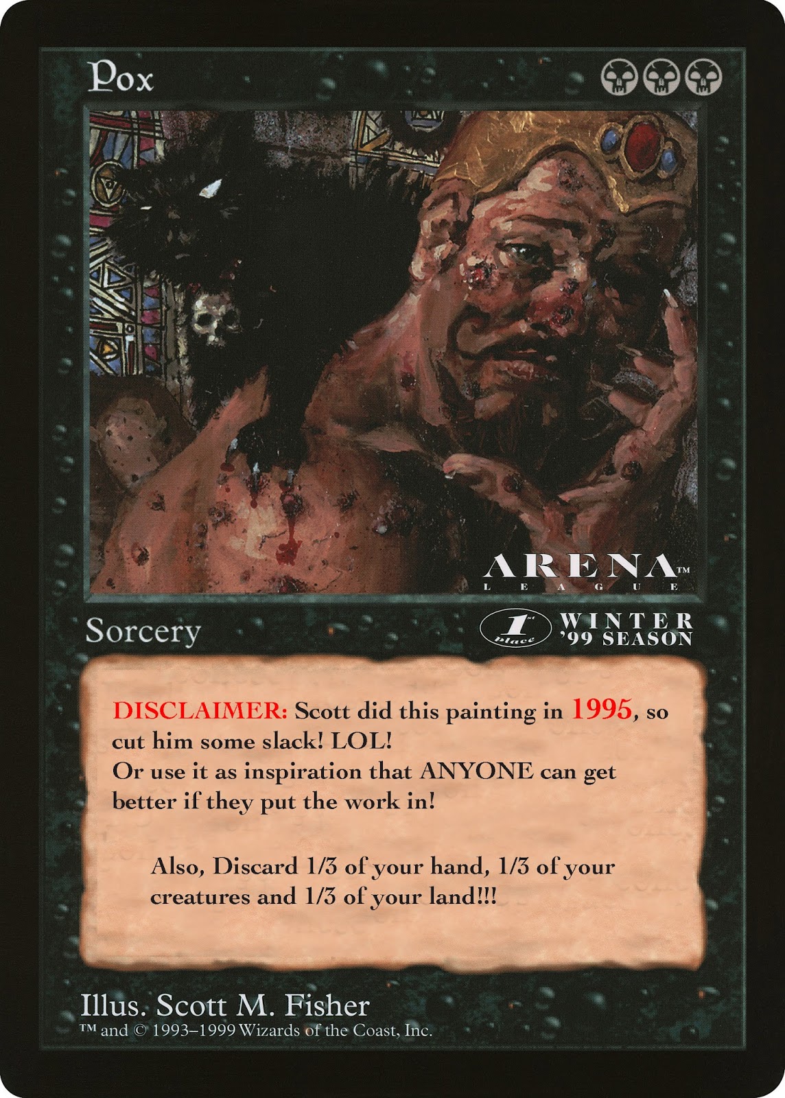
1) If you think 10 years producing your killer grown-up Fantasy art will translate to Children's books, you are wrong. For instance, I didn't show my first children's book editor the illustration I did for the Magic The Gathering card  'POX'! (And I was really proud of those oozing sores I painted. They glistened.)


Disclaimer: Not my shining artistic moment, but it was 1995!


You will have to start from the ground up. I was smart enough to do it early, while using the foundation I'd built in Game art to support the excursion.


In fact, I did not show my kids book editor my fantasy art until we'd been working together for a year. With the help and keen eyes of my dear friend and Kids Book genius, Angela DiTerlizzi, I curated a portfolio specifically for the picture book and middle grade world. (Naturally the skills I picked up in Fantasy Art were helpful, even if behind the scenes.)


The same applies to fine art. I came out of college with a fine art/gallery portfolio. I went to Dragon Con to show the work to gaming companies- having no fantasy art in the portfolio. You are probably saying, "But I am sure the Art Director will see that I can draw well and therefor, know I can draw whatever they need, right? Skillz are skillz, after all." WRONG.


After showing my fine art portfolio to the first Art Director at a game company, he said, "Wow man, your work is freaking fantastic. Heck, I'd like to put it on the wall of my house... But what the hell does it have to do with my Space Ship game? Next!"


2) Which brings me to my second overlapping point. Target your market. Know what that art director does for a job and what sort of art they may be looking for. Show them that. Sounds easy, but you wouldn't believe how many people have academic life drawing in their kids book portfolio. Save the life drawing for if you apply to a college- to teach drawing.


3) This brings us back to the website. Ideally I feel it would be great to have a separate website for each style you do. But more realistically, the way I have handled it is to have distinct categories for my different disciplines.


Cons of a varied portfolio:


Even though I've kept things separate, I am sure I have lost jobs because of the diversity. Maybe a fantasy Art Director I hadn't worked with in a while thought, "Oh I guess Scott is just doing Children's books now." It is a risk I've been willing to take.


You also run into the issue of being Jack of all trades and King of none.  So remember if you do this, you have to be pretty damn good at all of the disciplines. And slowly inch them up together after your initial commitment to one thing. Do I think I maybe could have reached a loftier rung of the ladder, much earlier, had I stuck to one thing the whole time? Yes I do. But then, maybe I'd be stuck doing one thing forever.


Pros of a varied portfolio: I can honestly say I have never been with out work since 1995, for the simple fact that, if one genre is quite, chances are there is something going on in another. Which is why I was willing to take the risk. I haven't done a picture book in quite a few years, but based on what I did before, I think I could probably find a door cracked enough to get back in. And that is what a career is. A series of slightly cracked doors that you get a toe in, then a foot, then slither the rest inside.


Final thought: I use to say to my wife, 'Teresa, I wish I had like 6 months to settle down into one style, and figure out what the hell I REALLY want to do. Cause I love it all!" And she replied, "Scott, if you take 6 months to figure it out, you won't settle on one style, you will come back with 10 new styles."


Looking back, I am actually glad that I didn't blow up huge in my 20s for some style that I would have to produce for the rest of my life. (Though 20s Scott would give me the finger, cause he sure wanted that.) I have worn many hats, which spread me out pretty far. But the truth is, I feel the paths all starting to come back together into something new. After all, there would be no 'Buffy The Vampire Slayer' covers had I not done the children's book Lottie Paris. Some of those same techniques are being applied to very different genres. And I don't know that I would have arrived at the mixed media solutions I have, had I stuck to one path.


I will end on something my great friend and artist Matt Mitchell ( http://100facesofwarexperience.org/portrait-gallery/) said to me, "Scott, maybe your 'style isn't one thing. Maybe it is many things in one?" These days I feel Matt is a prophet.

Thursday, March 23, 2017

Love the Mullet: Working on Grafix Dura-lar


'Business in the front and party in the back.' Dura-lar, aka, the Mullet of painting surfaces.


I first stepped into working on Dura-lar on a journey for the above. I wanted a surface that I could do detail work on the front side, but also be able to cut loose, get aggressive with my mark making on the reverse, and NOT mess up all the hard work I'd already done.


I tried vellum, or the modern version of vellum that comes in a pad (like a thick tracing paper). But it wrinkled when wet. Which can have some cool effects, but not what I was after. I do Yupo once in a while, but almost all the work has to happen on the front, because it isn't nearly as translucent.


Then I discovered the Grafix Dura-lar. It does not wrinkle no matter how wet you get it. And it has taken everything I have thrown at it from graphite to oil paint, like a champ.


The first thing to know is I use the MATTE version. Not the 'wet media' version. The matte will take dry media (Prisma, graphite, charcoal, pastel.) and wet media (Acrylic ink, acrylagouache, enamel, oil paint).


Because the matte is translucent, and not clear, it will ghost out what ever work is done on the reverse. I love this aspect because it is automatic atmospheric perspective, and lets you judge your final, darkest accents on the front.


What follows is a step by step of my Angel and Faith cover #19 for Dark Horse Comics. I am using Prisma Color pencil FW ink and Acrylagouache:


  This is the level I took my digital comp before even beginning to make
it real. I like to have most of the design questions answered, which
frees me in the application of materials, because I can have fun with
such a solid foundation beneath me.


The rough drawing is printed out and is now on my light box with the
Dura-lar over the print. I have selected pencils within in a limited
range of values.


 Time to DRAW! I did most of the first character with one prisma pencil.
Note how FLAT prisma color goes down on duralar. It is almost like
gouache!


 I work my way through the second character in darker Prisma values than
the first. I am basically working in color zones through out the piece.


  Having finished the characters, I move on to the swords and the falling leaves.


 Detail shots.


For the third character I wanted a softer feel, so I used the side of the pencil for shading.


And here we have the drawing on dura-lar with a piece of white paper
behind it. Any values you saw prior to this were the original print-out
of my rough drawing.


I flip the drawing over and start working the back side. I mix a quick
gradient of Acrylagouache on my pallet, and start filling in the
transition of the leaves.


And when we flip it back over to the front, you can see the line-work
over the leaves. Some ask, "Why not just do it all on the front?" And
the reason is, it would be much harder to draw with colored pencil on
top of lumpy paint. And I want the lines to show, for as I get older I
realize the true heart of an artist is in the drawing. (No matter how
you frost it.)


 Filling in the swords on the back, and the flip reveal.


The below sequence shows the puddle of value I mix for Angel, and the
ham fisted 'render' I do on the back side of figures. So there will be
some transition in the flat, some base structure, but the detail is all
on the front.


Same thing for Faith, filling in her form on the reverse with a painted gradient and crude modeling.


 Ahh... but the magic is in the FLIP! The drawing is doing all the work!


 With my dark and middle values established, it is time to work up the
highlights! Again using a range of three lighter value prisma pencils.


And here is the entire scene with the major elements drawn on front and painted on back. Now it is time to have fun!


 This is where the really aggressive things happen. Spatter, streaks,
scratches it is all fair game because I know the major details of the
piece will be pristine on the front.


 Flipping back over for more fun. You often have to paint in reverse, like an animation cel painter or a glass painter. Protecting things like figures with flat paint before you start up the party wagon of texture.


And the final flip! Sometimes I will cover the entire back with white after it is done.


Hope you enjoyed it!