Friday, March 31, 2017

White Trash Zombie Unchained


-By Dan dos Santos


Here is a new piece that was recently released. This is for the 6th book in Diana Rowland's White Trash Zombie series.


This cover needed to be completed for the Publisher's Sales Catalog before the book had actually been written. Which means I didn't have a lot of info to work from. But the Author did know 2 things about the story... The title would be 'White Trash Zombie Unchained', and that it would have zombie alligators.


Weirdly, this was all I needed.


The word 'Unchained' and the notion of alligators brought to mind images I'd seen of people walking tigers and hyenas on leashes. Why not alligators then? The image of a zombie walking a pair of zombie alligators on leashes seemed just the right amount of campy/bad ass that this series calls for.


Time was short, and there wasn't a manuscript to pull from, so I just offered up the first idea I had (with some color variations), and we rolled with it.


After sketch approval, I set about painting the final art. First I hired a local model for some reference...


And combined that with some toy alligators and crocodiles...


I then jumped into the final painting. I start with a detailed underdrawing on illustration board. This painting is about 20x30 inches.


I sealed the drawing, and toned the background with a quick wash of black acrylic. After that was dry, I went right into it with oil paints.


I got pretty far into the piece, like REALLY far, and decided I just wasn't happy with the overall palette. The client wasn't either.


The monochromatic scheme worked well in the sketch phase, but as things took shape, it just didn't look right any more. The was an energy in the sketch that wasn't coming across.


We decided to ramp it up and make the whole thing a lot more playful and colorful. This piece underwent quite a few revisions, both digitally and traditionally.


I also did the type design for the cover. This gave me a chance to plan accordingly and use the type as a means of introducing certain colors that the illustration really needed. Below is the final cover with type treatment.


Thursday, March 30, 2017

Wednesday, March 29, 2017

How to Talk to Art Directors IRL (Spectrum Live 2017 Edition)


By Lauren Panepinto


I've been art directing book covers for over 10 years now, and hands down the number one question I get from artists is always "How do I approach art directors?" And while email is nice, and postcards can be great, but the best way to meet and interact with art directors is in person. At industry events and conventions, art directors show up to meet new talent, connect with artists they already know, and do a lot of mentoring via portfolio reviews. If you've ever been to a convention like Spectrum or Illuxcon, you know ADs are pretty constantly reviewing as many portfolios as they can between sunrise and when they collapse back into their hotel beds. Art Directors know how impactful direct feedback can be to artists, and we try to make ourselves as available as possible.


Who us? Intimidating? No way!


But meeting in person isn't as safe and easy as shooting off an email or mailing a postcard is. You have to interact with ADs, and that can be scary. Although I know most of the ADs that go to cons are there to help artists and be mentoring, not harsh and judgemental, it can still be incredibly intimidating to walk up to us and ask for your work to be reviewed. If you are the type of person who deals with social anxiety, that can be even more difficult.


That's why, in my four years of writing this column on Muddy Colors, I've tackled this issue in multiple articles:


Approaching Art Directors


The In-Person Portfolio Review


Physical vs. Virtual Networking 


In the past, for most conventions, portfolio review sign-ups in advance have been kind of inefficient. There's always a mad rush, servers always crash, and artists are somewhat randomly assigned to ADs because they're just trying to grab any reviews with anyone they can. At the last Spectrum Live, Marc Scheff & I tried an alternate system, where artists signed up for a few ADs at once, and we painstakingly went through portfolios and matched artists to ADs that fit their work styles and desired fields. Although it ended up in closer matches in the portfolio reviews, it was more work than reward in the end. However, what did seem to work well was the Art Director Lounge experiment. A space was set aside for ADs to sit when they were available to review portfolios, and artists either waited when the AD was there, or met them on the show floor, and decided a time to meet the AD back at the lounge area.


Spectrum Live is back at the end of April and I am excited to report that there are going to be no portfolio review sign-ups in advance. And that's going to be a great thing for artists. Spectrum has expanded the Art Director Lounge area, and now that AD's aren't going to get burnt out by doing hours of portfolio reviews back to back, we'll be much more available around the Lounge and the show floor. I believe this will result in artists being better matched to the ADs for them, as they will be able to approach the ADs they are specifically interested in talking to. It will also allow the ADs more flexibility to shuffle artists around between them, as often happens. An artist will start talking to one AD, and they'll say, you know what, this other AD would have great advice for you, or they would really be able to use your work, tell them I sent you.


Here's the floor plan for this year's Spectrum Live, and you can see, the AD Lounge has been expanded into an "Art Director's Aerie" (how exciting!).


If you're going to be at Spectrum, and you want to get some portfolio reviews from art directors and other artists, here's my advice:


�Read the previous muddy colors posts I linked to above


�Download the "Getting you Hired" Drawn + Drafted Bootcamp onesheet


�Remember that Art Directors at cons are expecting you to come up to them and want to talk about your work and ask for portfolio reviews. Just be polite, slowly work your way into the conversation, or wait for a break or catch them alone, and ask. We'll either look at your work right then and there, or if we're busy at that moment we'll work out a time to meet you later.


�Always have cards or postcards to hand out in case you don't get a chance to have a review with every AD you want, you can still give them your card.


Download the onesheet here.


If you're not going to be at Spectrum, bookmark this page for the next convention or industry event you're going to, and remember, there's nothing to be scared of. The worst thing that could happen is you have a slightly awkward conversation, and trust me, us ADs are used to it. And we're awkward sometimes too. It's better to ask and get that portfolio review and conversation you were hoping for, rather than letting your fear stop you.


See you in Kansas City!


Sketching Sanctuary


--Greg Manchess


I just completed a piece with Tor.com, for a short story entitled, "Sanctuary," and there�s a part in the story of a character that actually does a sketch of two generation ships in low orbit over an Earth-like planet. A small deltoid ship leaving the hangar deck.


I did a few too many thumbnails trying to decide just how I wanted to see these ships. But clients love it when you do that. You just have be careful to show them the only ones you truly want to illustrate. (I've messed that part up many times while trying to please the client, and neglecting my own tastes. Which is why they usually come to you in the first place.)


The character was probably onboard when they drew this scene, but I preferred to use a pov from outside the ships as I wanted to see more ship design. Maybe they were using an extra-vehicular device, much like NASA has developed. I read into it a bit in order to get a good drawing out of the assignment.


The visual was described rather specifically in the story so I needed to make it look like a sketch. We kept it loose to reflect that the character was probably scratching it out in a short period of time. Conveniently, the sketch, completed in soft pencil, then became the final piece for the story.


I also figured the character was a pretty fair drawer.


Y�know�ahem�just sayin�.

Tuesday, March 28, 2017

Applying Transparent Color in Photoshop


By Justin Gerard


In a recent post I was asked if I'd go into more detail about how I apply and saturate color when I work digitally. Today, I'll be giving a brief overview of this.


Please note that this post is geared toward people who are familiar with Photoshop, but still searching for how to best use it to colorize their illustrations. Photoshop Geniuses may find the following a little basic. (Digital ninjas, yetis, warriors, and Kevin Sorbos will find this utterly beneath them)


For the purposes of this post, I created the above monochrome watercolor to colorize. I usually work over full color watercolors, but this should help keep things a bit simpler. (Just know that you can use all these same principles when working over full color work!)


NOW, FIRST OF ALL:

Painting digitally over drawing or a monochrome painting has 2 major pitfalls to avoid:


#1 The Pernicious Photo-tint Look.  (Think: old colozied photographs) We don't want this.

#2 The Vile Plastic Over-painted Look. (Think: purple wolf baying the moon airbrushed onto the side of a mobile home) We don't want this either.


The first pitfall suffers from too much information from the original image, while the second suffers from not enough.  We want somewhere in between.  And thankfully, Photoshop has been built specifically for this. All we have to do is use the right combination of tools within it.


SO LET'S GET STARTED WITH THE BASICS:


Layer Modes 


To apply color in Photoshop I begin by making a new layer and then selecting a mode for it.  In the example below of Little Red "Gonna-Ruin-Your-Day" Riding Hood, I have applied a flat red color to a selected area of her cloak.  As I change the layer mode we see how the effect dramatically changes. 


As you can see, most of these when used alone, will leave our image looking photo-tinted. (Pitfall #1)


That is where a process of applying a combination of several different layer modes in sequence can be extremely helpful. Consider the following combinations:


Notice how the final effect in all of these offers a more natural looking saturation of colors. Here's why this works:


A surfaces true color is only revealed in the area between the direct light and the shadow. 


For this reason, we are only used to seeing "true" red in limited areas. When we see an object painted in a single shade of red, it looks wrong and somehow flattened.  This is because where the object receives direct light, the red will take on the color cast of that light, and where it is in shadow, it will take on the color cast of the environment's ambient light. Furthermore as objects recede from the viewer the color is further altered by atmospheric perspective.


Certain layer modes saturate more heavily than others. Some darken as they saturate, others lighten.


OKAY JUSTIN, THIS IS STUPID AND YOU'RE STUPID. WHY NOT JUST PAINT WITH NORMAL LAYERS?


Normal layers are great! If you are just getting started, you should work with just these until you feel you understand them.  They behave the most predictably and are extremely versatile if you are using brushes with low flow or opacity.

However, if you are adding digital layers over top of a traditionally painted image you will find that eventually you obliterate portions of your original, and the that the final effect is plastic and uneven. (Pitfall #2)  To truly take advantage of Photoshop's power, you need to use transparent layer modes.


Photoshop has a dizzying array of options for colorization. What is important is finding what works for you. There is no real right or wrong. It is just whatever you can use to get what's in your head onto the screen.


For me, the majority of my transparent layers are made up of Multiply, Color, Soft Light and Screen.  You can do essentially anything with just these four and end up with a solid image.


Multiply Layers tend to darken and add chroma in a very dull application. This is great for slowly building up colors and adding texture and tone to your image. It is very much like working with traditional watercolor. Great for building shadows and toning your image.


Screen layers are essentially the opposite of multiply, these also add color slowly, but they lighten instead of darken. I use these to add direct lighting over the dark layers below.  By picking a warm yellow color here I am able to slowly work up a nice natural looking lighting effect to my figure.


Soft Light Layers are bonkers. They have no master, and obey no man. The math that governs them is not fully known to science. What I do know is that when a bright color is used on a soft light layer, it will allow for a very bright saturation of color which does not affect the details beneath it.  For instance, I used a bright green color on a soft light layer to really pop the bright greens out from the rest of the image.


Color Dodge Layers scorch out highlights. They are extremely brutal and should be used VERY sparingly. Too much and you are lighting your birthday cake candles with a flamethrower. But when used sparingly, they can help to intensify your brightly lit areas as well as any glints of detail light. I use Color Dodge layers to sharpen highlight areas, add rimlights, and sharpen object profiles against their backgrounds. When alternated with multiply layers it will help push the value range of the image.


Color Layers. Not shown here because I use them so sparingly, but I do use basic color layers to push and pull color in limited areas. The Color layer mode is the classic means of photo-tinting, (and I need not badger you any further with warnings there). Just know that you shouldn't overuse them, but that in limited doses they are excellent.  For instance, killing chroma: If an area is too red, I can select a blue color and lightly apply it on a Color Layer and it will pull the red back into check.


Normal Layers. Finally, there is just no escaping at least some opaque work for me when I work like this. But now that we have already established our value range and our colors are fully laid out, we can add details and opaque work that blends rather seamlessly with the rest of our image.  I also use it very transparently and often set the layer opacity to less than 50%.


This general sequence offers me solutions to the problems I generally face as I work through an image. Everyone's artistic temperament is a little different, so play around with the different modes in different sequences and see what works best for you.


I hope this was helpful! As always, I take post requests, so if there is something you'd like me to cover please let me know in the comments!


Monday, March 27, 2017

Scholarship Reminder, Deadline Friday!


Just a reminder that we are giving away a fully-paid scholarship to attend this year's IMC Workshop. Any one can apply... old, young, pro, novice, former students... any one. So give it a shot and apply, is as simple as filling out a form.


The deadline for submissions is this Friday, March 31st, 11:59 PM EST


Photos � David Palumbo

Saturday, March 25, 2017

A List of Tools to Achieve a Stronger Likeness


-By Ron Lemen


I�m tackling a challenging task with a current project that is fun and frustrating at the same time. I have to draw consistent likenesses with several individuals and make up expressions that I have not seen them perform. It is one of those challenges that can sometimes makes me want to take up accounting or stamping out Cheerio�s for a living. The task is hard enough as it is with a single image, add to it several dozen other frames and the gray hairs multiply quickly.


like theater, the expressions/acting should exaggerate the gesture or emotion, or heighten it so everyone in the audience can experience the moment, not just the first few rows. This means that the actor should know a great deal about what it means to idealize each emotion and as well, learn to turn the dial of subtlety and create an entire gradient of emotions with equal conviction. Idealizing, or clarifying the gesture, the expression, or the action, is essential for the story to be told with the greatest assurance of clarity in mind. The reality is that more than likely you will not have reference for every specific story beat and you will have to make them up and still capture the likeness.


But to express extremes and/or very well designed subtlety, the likeness of the individual must be well controlled. This means that before beginning any illustration it is a good idea to warm up with the subject until the subject could theoretically be drawn without the reference.


I have tried to break down the process of generating a likeness by separating most of the key components into a design language. When we draw, we are using the combination of these tools plus drawing experience and all the subtle nuances of that, and knowledge of anatomy.


I am using one of my subjects for a project I am currently working on. His name is Chris Roberts and he is a host for a Skateboarding Podcast called The Nine Club Show. If you like skating its worth listening to, long overdue. Anyway, here are the two reference points I am working from along with all the video footage from the Podcast hidden behind his mic. The Profile ref is a frame grab from one of the few moments he is filmed in profile so it was great that I actually found this. Notice that in many front views you might miss the change in planes between the cheek bones and the muzzle and the pentagonal design with the mustache and beard shapes on his face. This is exactly why it is important to hunt down solid reference especially when the job calls for a likeness of a celebrity or public figure.


Here is a brief list of items to consider when attempting to capture a likeness and some ideas about how they might change when changing expressions.


1. Contour � Contour is not a cardboard cut-out. It is very complex and waivers between forward facing shapes and the back of the object. Related to the human head, above the cheek bones the contour is broken up into a few zones; the top of the skull contour is the middle of the skulls mass and the sides are really the back portion of the skull. Below the cheek bones the contour is the back of the jaw, and towards the chin that contour is the front of the skull. (Brain burst moment)


2. Features � One of the more important aspect of capturing a likeness is getting the distance between the features accurate. The starting point to establish this distance is the keystone shape between the eyebrows called the Glabella. The pitch on both sides of this inverted triangle are measured from the sloping angle of both eyebrows. The distance between the brows and the angle of both brows helps the artist triangulate this feature.


All the other features are triangulated back to the centerline and keyed off of the distance between the eyes. Most of us do not have perfectly symmetrical features so remember that when you are establishing the triangulation between the reference points that the only fixed point will be the one on the centerline, the other two points will more than likely vary in elevation and distance from each other and the centerline.


3. Orthographic relationship between the front view and the side view � It would be fantastic to have video footage of the individual but if you are doing a graphic sequence of Abraham Lincoln that could be a bit tricky. However, if you can find reference for both a pretty solid front view and a pretty solid profile view then you are in great shape.


Lines on the face divide volumes from one another, natural lines are plane breaks from the skeletal and muscular/fatty masses under the skin. Lines from age express similar mass divisions on the face and occur perpendicular to muscle forms. Where these lines occur are usually divisions for forward protruding masses, or sideways protruding masses. Along with the line break there should also be a value change of some sort. A hint, if the light source is powerful enough to diminish this subtle lighting of form chance, especially on a forward-facing portrait, the other indicator is temperature change, which is a fancy way of saying color change.


4. Gesture � Sometimes doing all the math will still capture something less like the person, less correct in the �feeling�.  A person is living, a photo is a snapshot in time.  That snapshot captured them mid breath, inhaling or exhaling and everything changes on us in very subtle ways.  Was the photo shot when the person was happy, angry, depressed?  Etc.   We have to be very careful in how we choose that reference and take many of these aspects into consideration when launching from that reference point.  Sometimes that quick gestural line that was barely thought over when executed can be that mark that makes everything �just right� in capturing not just a likeness, but the personality of the individual so many might know so well.


I also feel it is important to know how to cartoon or line gesture as much as sight measure or whatever other academic tools the artist trains to use.  Without this skill I feel that another aspect of likeness, caricature, will not translate very well and the likeness can easily border line on not really looking quite like the individual or have a measured out look to it rather than it "feeling" right in its effortlessness.  These are short gesture sketches, each about 3 minutes each attempting to exaggerate the shape language and become familiar with the design of his portrait.


5. Value � Value=Form and form is the other likeness factor.  Value sets up color for when that is applied so value is complexion and dimension simultaneously.  This is where multiple views will be very helpful to deduce the images that you are copying from.  Looking for the color and light changes will be important.  What you see on one side of the head will be similar on the other side of the head but do not assume they will be perfect


6. Shapes � Abstraction is seeing beyond the norm and looking for other attributes that help solve the drawing problems we encounter when copying something.  Shape is an abstract concept.  We look beyond the details and sum up the space we think we are perceiving and we use that geometric design as another tool to help capture the essence of the subject.


7. Drawing experience � without an understanding of how to control lines and tones, many of the tools above will be difficult to control and maintain consistently from one drawing to the next.  Learning to control line weight, pressure, edge, shape, etc. is another essential tool in helping to make capturing a likeness less difficult to accomplish.


8. Anatomy and understanding plane breaks � in addition to drawing experience, training in anatomy is also important to help facilitate the drawing experience with reference points to achieve using the above tools.  This is not as difficult as it may sound but it does require a game plan to build on or it can spin out of control rather quickly.


This was roughly 30 minutes using a Blackwing Soft pencil and 11 x 17" xerox paper, cheap but effective.  When I am sketching to learn I do not hold dearly to any of the drawings, they are all subject to abuse and radical change.  When I get nice paper I feel guilty when I have to butcher up a drawing to correct it, and I feel like I should not have made a major mistake on such important and expensive paper, which in the end is a goofy way to think.  It takes sacrifice to learn the tools of our trade.


When learning representational art, likeness is important.  To capture what you draw as accurately as possible is the only way to have an honest objective dialog between student and instructor, and is a solid way to judge that your eyes and hands are developing in your craft.  Likeness is also an important measure of how far along you are with your training and how much further you want to or should develop before looking to become a professional.  And to the professional a likeness is important so you know how to start from there then tweak as needed and still capture the essence of who it is that you are crafting up.


As soon as I get finished with this job I will get back to those color portraits.  Practice as much as you can between jobs or just whenever you can.  Have a goal when you practice so you can gauge whether you have accomplished more than just the act of drawing or painting, and Happy Arting.  

Friday, March 24, 2017

THE END


by 


Greg Ruth


Endings scare the shit out of most or all of us to some degree. Whatever the cause of it... a desire to not see what we're doing come to an end, or a natural reaction to the idea of death, who knows? But it's a devil that stalks us all, even more so by infinite degrees for those of us in inventive or creative endeavors. The full blank canvas of making art and the lack of safety net that inherently provides could easily encourage us to avoid this state at all costs. Wh

en we love a thing we're working on, we don't want it to end, and when we just want it to be over we can be afraid of what that might mean after. Basically finishing is HARD, but there is likely nothing more essential to any creative person than achieving this.


Finishing gives you permission to begin. It provides authorization to continue and offers, like every new day's morning light can, the ability to reinvent and start over. Not finishing keeps you stuck in a Groundhog's Day of nightmares creatively. It shows an inability to let go, to recognize a need to end, even if the piece hasn't reached the zenith predicted by its beginning. Finishing makes you a better artist and allows you to start over being an even better one.


A page from EDENTOWN


Another page from EDENTOWN

Not finishing leaves undone business that is hard to let go of creatively. I've had two major books never reach their end, and they both continue to plague me by calling out for me to return to finish them. They drive me crazy. One, discussed at length HERE, called THE CALENDAR PRIEST, meant as a loose follow up to my first full length graphic novel, SUDDEN GRAVITY, and my first and last creator owned project at Vertigo Comics, EDENTOWN. Both stalled out fro entirely different reasons, but both share the same nagging sensation of never achieving closure. Characters I adored stand tapping their feet staring at me in my mind waiting for me to honor them by telling their story, plot lines and story conflicts clog my creative pipes because I tend to withhold some of them to use in new work, because of the terrible what if... factor. Not finishing for artists makes us greedy for our work, and that is wholly unhealthy. I have trouble even now, having decided never to return to those, that maybe... just maybe I will. It's terrible. It's exile versus departing.


A misfired scan as evidence of outside forces conspiring against your intentions

What finishing does for us is important on a thousand different levels, first and foremost, it's so you can start the process all over again. Why is this the most essential bit? because an artist doesn't just make a piece, the artist makes many. The ethos of finishing forces us forward, and keeps kicking us out of whatever glorious or terrible nest we make for ourselves. It is how we grow, through challenge and change, and it is how we get better. But it is also how we redeem ourselves. We've all of us done terrible works, perceived or real, and for many of us those have even seen print. finishing and getting on with the next thing helps us cathartically shuffle forward, take lessons from whatever failures we just achieved and apply them to the next thing. One of the reasons I adore comics, is that a writer/artist gets to do this through a cycle of many on a single page. It fast forwards this process of development and allows you to become by the book's end, light years beyond where you were when you started.


From an unfinished book about a neighborhood bully seeking to be something better.


But finishing also gives us another important thing as a gift: it gives us closure and distance so we can see what we have done. It means we have done a thing to its full end and taken a thing to its furthest horizon and we know how to stop and move on. For professionals showing this capability is how we get more work and continue to be professionals. An author/artist that has a deep catalogue of completed books, gallery shows tend to get more largely on this basis. Even if you aren't a superstar or have enjoyed some larger level of success, the mere evidence of seeing the continuation and develop of working and finishing can be enough to be allowed to do it again. Finishing is then, the most important thing to provide one with the opportunity to begin.


After his debacle of a 2nd film following his freshman superstardom in Sex, Lies and Videotape, Steven Soderberg was asked if after having gone through that rise and crash if he had any advice for other storytellers, and he did: "The secret to surviving the dips and rises in any career is to get to the second effort, and finish it so you can hurry up and get to the third." I've remembered this and brought it up as often as I can when discussing art making, because we are so often seduced by the notion we as artists are making a single piece of art, and then another, when we really should remember we are really supposed to be making as many damned pieces as time on this earth allows us before it's over. Our capacity for volume is dependent on a number of things, and different for each of us, so one person's stock of accomplished works should never be compared to another. The key here that IS important is to remember to FINISH YOUR WORK. Even if that finish means walking away because you don't know where else it can go, or surrendering to life's intrusions that prevent you from continuing. DOn't hold onto to unfinished things like they get better by waiting for the right time. They don't. They moulder and hang on you like rocks ties by fishing hooks, and they keep you from being free to explore new directions that are all that making art is about.


Thursday, March 23, 2017

Love the Mullet: Working on Grafix Dura-lar


'Business in the front and party in the back.' Dura-lar, aka, the Mullet of painting surfaces.


I first stepped into working on Dura-lar on a journey for the above. I wanted a surface that I could do detail work on the front side, but also be able to cut loose, get aggressive with my mark making on the reverse, and NOT mess up all the hard work I'd already done.


I tried vellum, or the modern version of vellum that comes in a pad (like a thick tracing paper). But it wrinkled when wet. Which can have some cool effects, but not what I was after. I do Yupo once in a while, but almost all the work has to happen on the front, because it isn't nearly as translucent.


Then I discovered the Grafix Dura-lar. It does not wrinkle no matter how wet you get it. And it has taken everything I have thrown at it from graphite to oil paint, like a champ.


The first thing to know is I use the MATTE version. Not the 'wet media' version. The matte will take dry media (Prisma, graphite, charcoal, pastel.) and wet media (Acrylic ink, acrylagouache, enamel, oil paint).


Because the matte is translucent, and not clear, it will ghost out what ever work is done on the reverse. I love this aspect because it is automatic atmospheric perspective, and lets you judge your final, darkest accents on the front.


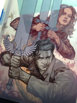
What follows is a step by step of my Angel and Faith cover #19 for Dark Horse Comics. I am using Prisma Color pencil FW ink and Acrylagouache:


  This is the level I took my digital comp before even beginning to make
it real. I like to have most of the design questions answered, which
frees me in the application of materials, because I can have fun with
such a solid foundation beneath me.


The rough drawing is printed out and is now on my light box with the
Dura-lar over the print. I have selected pencils within in a limited
range of values.


 Time to DRAW! I did most of the first character with one prisma pencil.
Note how FLAT prisma color goes down on duralar. It is almost like
gouache!


 I work my way through the second character in darker Prisma values than
the first. I am basically working in color zones through out the piece.


  Having finished the characters, I move on to the swords and the falling leaves.


 Detail shots.


For the third character I wanted a softer feel, so I used the side of the pencil for shading.


And here we have the drawing on dura-lar with a piece of white paper
behind it. Any values you saw prior to this were the original print-out
of my rough drawing.


I flip the drawing over and start working the back side. I mix a quick
gradient of Acrylagouache on my pallet, and start filling in the
transition of the leaves.


And when we flip it back over to the front, you can see the line-work
over the leaves. Some ask, "Why not just do it all on the front?" And
the reason is, it would be much harder to draw with colored pencil on
top of lumpy paint. And I want the lines to show, for as I get older I
realize the true heart of an artist is in the drawing. (No matter how
you frost it.)


 Filling in the swords on the back, and the flip reveal.


The below sequence shows the puddle of value I mix for Angel, and the
ham fisted 'render' I do on the back side of figures. So there will be
some transition in the flat, some base structure, but the detail is all
on the front.


Same thing for Faith, filling in her form on the reverse with a painted gradient and crude modeling.


 Ahh... but the magic is in the FLIP! The drawing is doing all the work!


 With my dark and middle values established, it is time to work up the
highlights! Again using a range of three lighter value prisma pencils.


And here is the entire scene with the major elements drawn on front and painted on back. Now it is time to have fun!


 This is where the really aggressive things happen. Spatter, streaks,
scratches it is all fair game because I know the major details of the
piece will be pristine on the front.


 Flipping back over for more fun. You often have to paint in reverse, like an animation cel painter or a glass painter. Protecting things like figures with flat paint before you start up the party wagon of texture.


And the final flip! Sometimes I will cover the entire back with white after it is done.


Hope you enjoyed it!