Tuesday, April 11, 2017

Plein Air Painting With Bill Robinson


by Cory Godbey


Plein air painting is one of those things I've been interested in but truthfully never really tried. 


The reality is, for me, painting is enough of a challenge without the whole natural world getting involved. I'm envious of those artists who can set up shop seemingly anywhere and pull together a painting!

Bill Robinson and I go way back (we first met in 2009 when I was curating a Maurice Sendak tribute art blog called Terrible Yellow Eyes). He has a decorated career in children's books and animation and currently works as a visual development artist at Sony.

I thought I'd invite Bill over to share a little of his experience and expertise with plein air painting.

Enjoy!


How and when did you get started plein air painting?


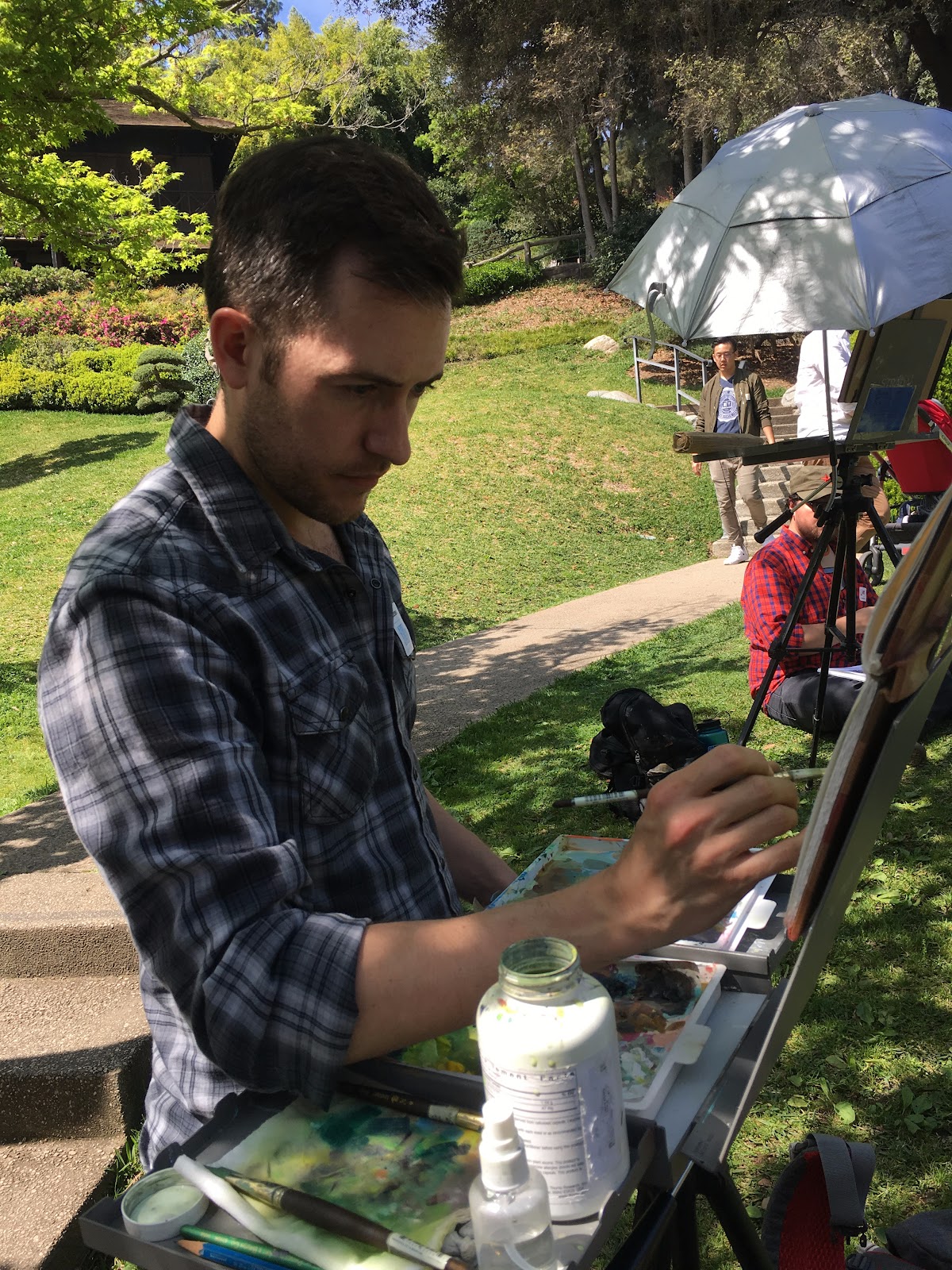
A little over a year ago I moved to Los Angeles and was working at my first job in feature animation with some very talented painters. When I started nosing around and asking them how they got so good, they mentioned that they go plein air painting as often as possible. I had seen plein air and even done a couple of workshops years ago, but the practice never really cemented for me. Lucky for me, we formed a little group of people who would go painting every day at lunch, setting up on the streets of Santa Monica near our office. Being able to see the gear, subjects, handling of paint...and doing it every day finally got me over the feeling of, �I have no idea what I�m doing� and made the whole process much more enjoyable.


What makes a good location for plein air painting? Do you decide where to go and then choose a spot or is there something in a particular landscape or place that you set out to find first?


I find myself more attracted to nature than architecture or cityscapes, which for me comes down to where I like to paint and what I like to spend hours staring at. I would usually rather be out on a sunny trail or near a stream than in a busy industrial area, though there is plenty of beauty to be found in factories, train yards, etc. and I think it�s a good idea to mix it up every now and then. When I head to to my general location, the first thing I look for is the lighting. If there�s a really beautiful shadow pattern or the light catches my eye and holds it, I will stop and consider that place for a painting. Subject matter itself doesn�t matter all that much, I�ve found that a tree or a rock or a flower or a mountain can all be painted in beautiful ways. When I�ve been to an area enough times I start to keep a mental log of spots I want to paint, which makes it easy the next time I�m there.


What sort of materials do you take with you on locations?


I�ve found that everyone has a different plein air setup, but the main thing for me is finding stuff that is lightweight and very portable. Here�s a look at my current setup:


PleinAirGear.jpg


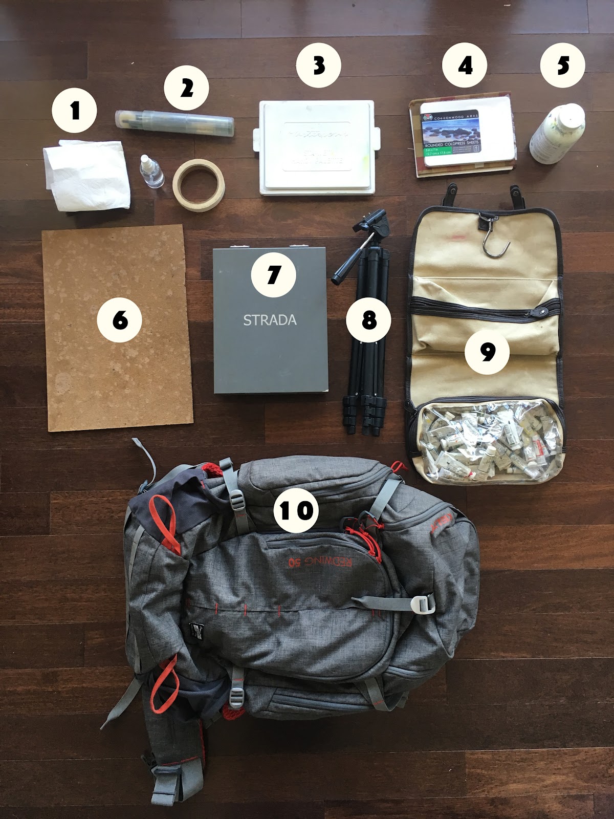
  1. Paper Towels, Spray Bottle, Artists Tape - These seems like add-ons, but they are essential! Paper towels especially, for getting the right consistency when mixing gouache. Too much water on your brush and you�ll be struggling. Spray bottle is good for keeping your palette wet.


  2. Brushes - I mostly use 2-3 brushes on a painting. Mainly a 1� flat and then maybe a �� flat for details. Once in awhile I use a round for smaller details. I love my cylindrical brush carrier, which keeps them from getting bent bristles in my backpack.


  3. Palette - I use a Sta-Wet palette for and it changed my life. I used to hate working with gouache because it dries out so quickly, especially in heat or direct sunlight. The Sta-Wet palette has a wet sponge and a special palette paper that keep your paints full of moisture, even days later. I also use a small spray bottle of water to refresh the paint if necessary.


  4. Paper/Pencils/Eraser - I work on a variety of surfaces, but mostly either cold press watercolor paper or hot press illustration board. I have started to prefer illustration board, mostly because you don�t have to worry about buckling or warping. I�ve always got a pencil and kneaded eraser in my kit for laying in quick sketches. The boards in the photo are from Cottonwood Arts.


  5. Water - I use an old pill bottle with a screw on cap to hold my water. It�s tiny, lightweight, and watertight.


  6. Masonite board - If you are using a small painting surface, it�s good to have a board to tape it down to.


  7. Pochade Box - I bit the bullet and bought a fancy STRADA easel. It�s lightweight, strong, super portable, and easy to use. No complaints. There are definitely cheaper options (including many homemade ones) for people just getting started.


  8. Tripod - I�m using a cheap old tripod I had lying around the house, but it would probably be a good idea to use something a little more sturdy. Just be careful of how heavy it might make your pack.


  9. Travel Toiletry Hanger/Paint - I had this old toiletry carrier and found that it is perfect for holding my supplies. It has a hanger hook up top, which I can hang on to my easel for easy access. I use gouache for my plein air paintings, mostly because it�s waterbased, opaque, and dries quickly. Also, the tubes are very small and easy to transport! I am fond of Holbein and Winsor & Newton, though there are other good brands out there.


  10. Backpack  - This Kelty Redwing bag is huge, with tons of zippers and pockets for all your supplies. It�s a serious backpacking kit, so you trade off a little more weight to use it. Sometimes I switch this out for a lightweight gym knapsack if I don�t need all the gear.


Current setup in action:


Walk us through your process.


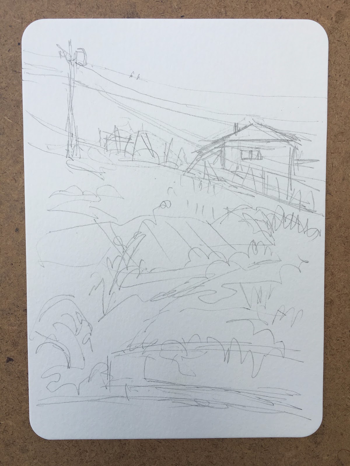
Step 1: Once I�ve selected a subject/area to paint, I take a few minutes to think about composition. This will depend on the format of my painting surface (sometimes it�s square, or wide, or tall, etc) but I tend to work rather small. This particular painting is about 5" x 7�. Once I�ve got a composition in mind (considering the rule of thirds, focal point, etc) I will do a very quick sketch. This is going to get covered by paint in a moment, so I keep it rough. I just want the key things like the telephone pole, the house, and the wall at the bottom in their basic positions.


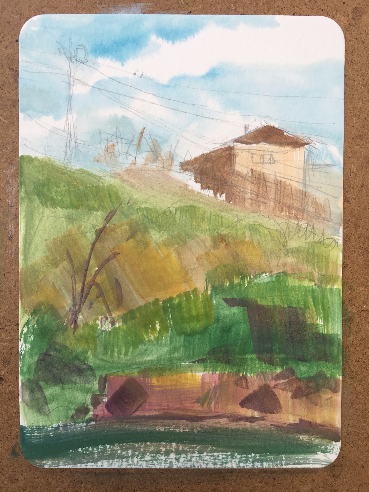
Step 2: Basic Block-In. I do this as quickly as possible, mostly working wet-in-wet. Don�t expect this phase to look good - if it does, you�re probably getting bogged down in detail. Sometimes I will work on white, other time I will ground my canvas with burnt sienna or something similar. In this case I kept it white for the sky. The thing about gouache (and watercolor) is that you will never get a paint as white as the original paper...so be careful with preserving it when you need to!


Step 3: Tightening Up - Here I�ve got my colors blocked in and am paying more attention to local color. I want the greens to have the right temperature and the browns and yellows to feel like they are in either light or shadow. It still looks very rough.


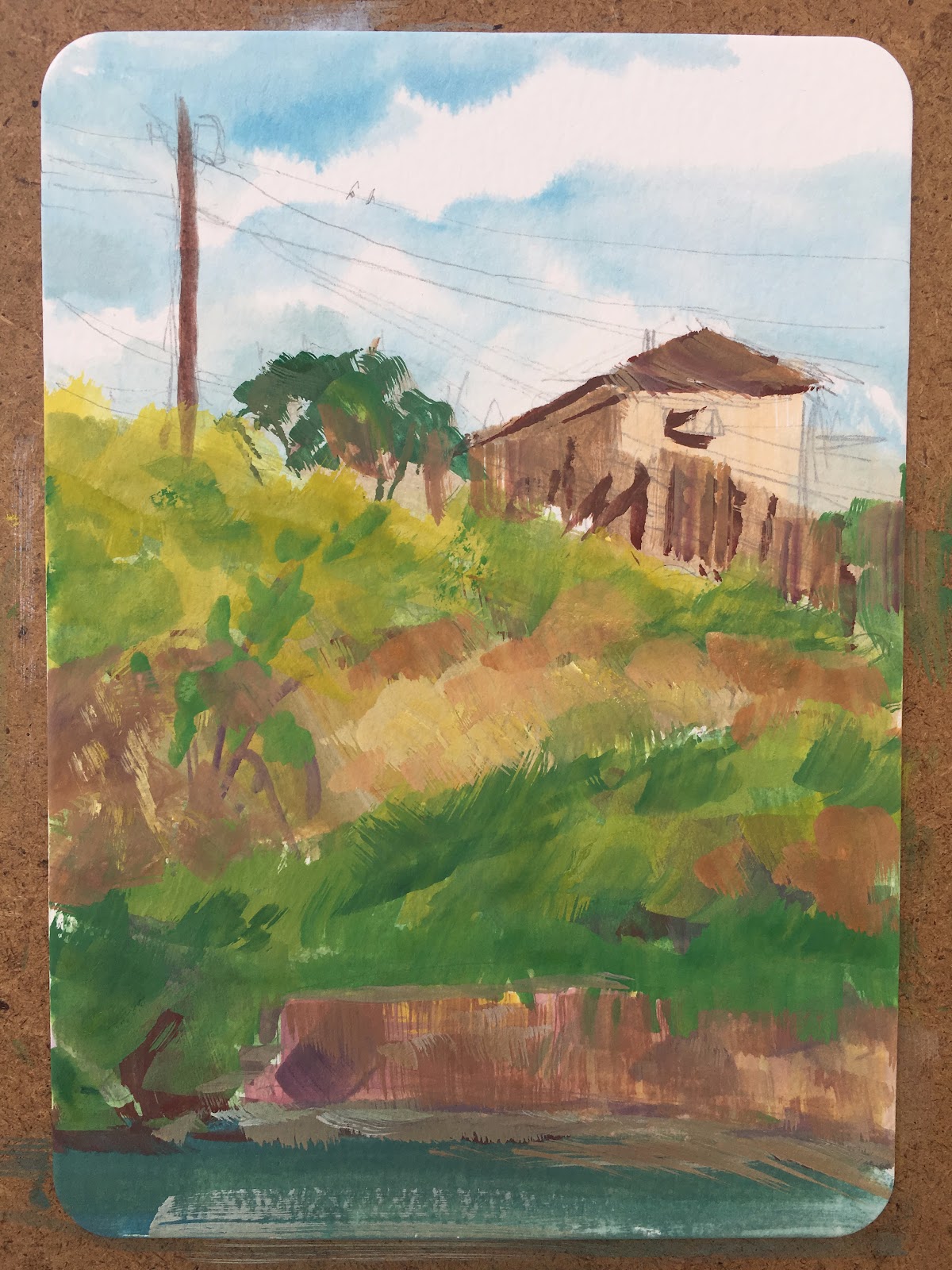
Step 4: Values: Now I�m starting to pay more attention to value. I lay in some of the darkest darks and try to get more key details locked down. I pay more attention to color variation, like adding in some purples to the dirt trail and some blues to the sides of the house.


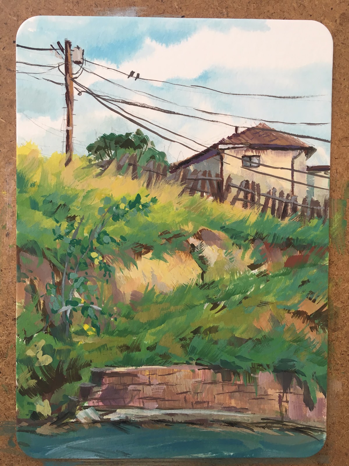
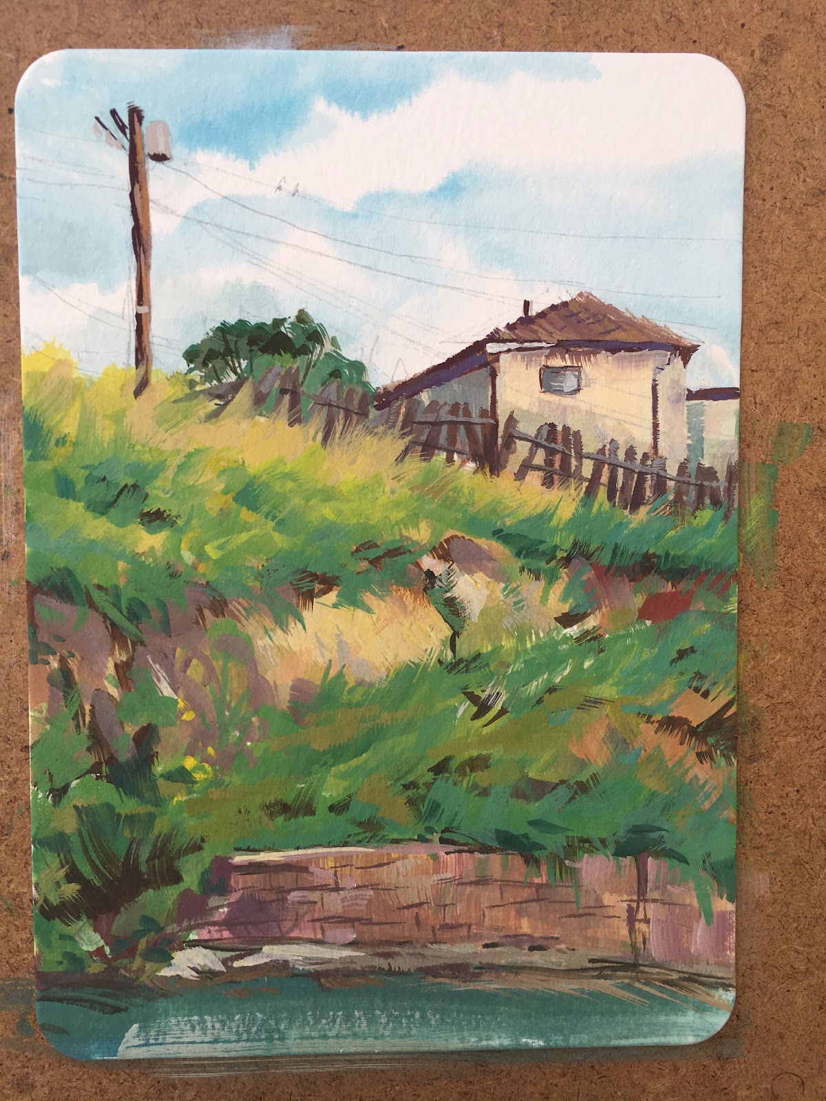
Step 5: Finished! Here I�ve added the fine details, the lines on the bricks, the fence posts, the telephone wires, small leaves and flowers. It�s amazing how much these little details bring a painting to life, but they would not work if the rest of the foundation had not been laid down.


I'm curious, do you find that people want to see what you're up to or do they give you space?


I have gotten pretty mixed reactions, depending on where I am set up. Most people are very friendly and just excited to see what you�re working on. I�ve painted in big cities, where people have made jokes about how they wish they could spend their day painting instead of working. (Reconsider your life choices!) I�ve painted at Disneyland, where kids get super excited to see an artist doing something. Mostly I paint out on nature trails where I get to meet dogs and chat with their owners!


Thanks so much for sharing your expertise with us, Bill! Where can people find you online?


My pleasure! I share my plein air paintings and a lot of my process shots on my Instagram:


I�m also on Twitter, Tumblr, and Facebook.


Also, I understand that you have a show coming up as well, where can people find that?


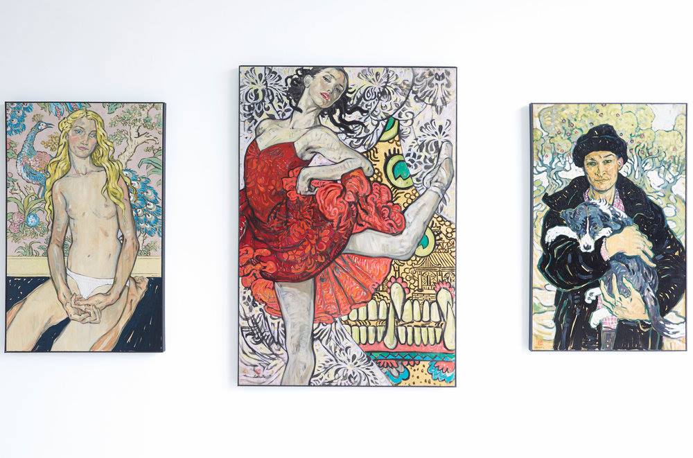
Yes! I am very excited to announce that I will be having my first solo show of my pleinair artwork at the Light Grey Art Lab in Minneapolis. It opens April 21 and goes through May 20. The artwork will also be available online after the show opens. 


Check out www.lightgreyartlab.com for more info as it becomes available!


Monday, April 10, 2017

Self Analysis


By Jesper Ejsing


Seed of renewal, Magic the Gathering


I just recently did a workshop in Florence about creating illustrations. It got me to think about the many thoughts that is put into an illustration, both consciously and on autopilot. The auto pilot thing is the hardest to put into words because  so many of the choices you make comes from routine or experiences. You draw something a certain way because you found out that works well and this is � how I do it�. But doing a workshop makes you think harder on these things and you are being forced into putting the autopilot up for inspection.

One of the things I find useful is to analyze my own paintings. This is best done a good while after you have finished one -not the weeks after, where you still remember everything about it and you are still not able to look at it with fresh eyes. After half a year when you pull out a painting you can almost look at it as if someone else painted it and this is where you get to see the real thing taken out of the intention you had when you painted it. Instead you see what you got.

Here is my thought about a painting from last year done for a Magic the Gathering card.


The bad:

First

Right away I dislike the lowest hand a lot. The light on it is wrong. The top of the hand is way to light and lit with equal value as the bottom part. Wish I had made it darker against the light from the egg. Now it looks almost transparent because of my insecurity in litting it right. Perhaps this is one of the times where I should have taken a reference photo to help in getting the light effect right.

Second 

is the feet and leg position. It worked well in my sketches but here it is almost impossible to see where the legs go and which is in front or on top of the other. Yes, I did choose a strange half kneeling/sitting pose, that is not quite easy to show well, but I did it to add a little interest and coolness rather than a straight up kneeling pose. But looking at it now I wish I had used more surface lines and cast shadow rendering to establish the leg position right. I am glad I did not render the legs with dabbled light but kept them kind of muted down so that you do not really see the unclarity.

Third 

The strap behind the braid creates a perfect tangent. It is almost impossible to not read the braid as a long braid with a belt buckle in the end. This is an uttermost rookie mistake. I might have thought � Arhhhh never mind, I will fix it with colors� but just never did.

Forth

I think the outfit he is wearing is a boring standard 1 elf costume. I wish I had choosen more deliberate clothing for him - something that would have established his profession better. This is hovering in-between a wizard ( sleeves and  flask ) and a fighter ( body armor and greaves ) I know that this comes from not going off from a style guide, since this card art is for a card out of the usual Magic the Gathering settings, but that shouldn�t have kept me from making up a design myself. I have no problem with classical or traditional fantasy, I really like it, and do not think it is boring, but I still think a characters costume should tell you something about the guy and not look like a costume.

Fifth

I wish I had made it clearer that it is a guy and not a girl. Instantly we read it as a girl because of the long hair and the elegant pose. Just saying: guys can have long hair too and be elegant, but I have to accept that there is a reason why 95% of people referring to this painting says � elf-girl��


The good:

First

First thing that strikes me is the colors. The contrast between orange and blue is a really strong temperature difference. Having a background in a bluish tone and a foreground in a warm tone establishes the planes in the picture very clear.

Second

Further more the silhouette reading of the figure is very strong. The dark hair and the big brows against the light background makes his face very easy to read.

Third

The composition of the branches in the background is helping in seeing the figure clearly. The branch that circular frames his face is nice, and the big non detailed trunk acts as an easy backdrop for the figure. The details in the background is well off from the figure to not mess with the silhouette.

Forth

I am still happy with the facial design. The brows, long forehead and the ears makes him a more personal version of an elf.

Fifth

This is one of my better versions of rim light. It is used only where it matters. In the face it creates a temperature difference that helps in giving him a more three-dimensional look. On the arms the light creeps into the shapes and becomes a cylinder shape that acts as a bridge between the warm light from the eggs and the moonlight from the background. I like to have an area that pulls something from the background into the foreground, thus placing the figure better into the environments.


Saturday, April 8, 2017

Observe, It's the Foundation


And while you're at it, Experiment too!


by Vanessa Lemen


My experience as an artist has a pretty equal-parts mixture of foundation and invention, and without one, the other just wouldn't be the same. I credit a healthy dose of observation from life, with a large amount of experimentation and imagination mixed in for carrying my art to where it is currently, and where it will go from here.


OBSERVATION FROM LIFE


Doing studies from life means exercising and practicing in order to gain a better understanding of the subject we're observing, the tools we're using, and all of the other elements that come into play in that moment. Truly observing from life is painting and/or drawing in real time � during the actual time we're observing. The point to the part of the phrase �from life� is that it's in that moment, from the actual subject or object or scene that we're observing, and it's an invaluable asset to our drawing and painting experience, no matter what direction we intend to go in with the knowledge we glean from it.


Observation from life gives us the opportunity to apply what we know (for example, construction, perspective, anatomy, composition) as well as what we observe in our surroundings. It teaches us how to see and what to look for, and solidifies the understanding of what we're looking at based on what we already know. We can take those opportunities to hone our skills in certain aspects, too. For example, when working from life, we can work in different lighting situations. We are able to observe form by setting up a source of constant lighting indoors or work in inconsistent lighting situations outdoors to broaden the extent of what we know. It's a means of studying value, color, form, light and shadow, while putting our knowledge of our materials to practice as well. It's also a way in which to focus on what we're observing and give it our full attention. Many times, I use the opportunity to work from life as a means of focusing on different aspects of the experience.


Here are a few still life paintings working in different lighting situations, with assorted objects that have varying colors and textured surfaces. There are some paintings here that are longer set-ups of 2-3 hours, and some that are quick sketches. Some are more finished than others, and I've used different brushwork for different effects and purposes as well as palette knife application.


Below are a few examples of figure and portrait paintings and drawings from life. The time spent on these varies anywhere from 5-minute quick sketches to 12-hour long poses.


With quick sketches, my focus is usually on the gesture and indication of movement of the pose. It's important that I'm standing when painting, I'm able to move around and step up and back from the canvas, and that I have full motion of my arm to make quick, long strokes.


With the long poses, the application is much different than quick sketch in that it's an indirect approach, working in 3-hour increments, and the focus is on keen observation of form, indication of surface texture, and ultimately on the details in the finishing hours. Some of the other paintings here are direct paintings, focusing on color using looser brushwork or tiling, building up the painting in one sitting.


This image comparison below shows Bastien-Lepage's painting 'Diogenes' on the left, and my painting on the right inspired by the Bastien-Lepage painting, done from a model in the same pose.


Below are examples of charcoal drawings from poses ranging from 1 hour to 6 hours, starting with light construction lines and then adding value on the form, with any kind of detail in the end stage of the drawing.


We can also apply these aspects to plein air painting as well as urban sketching. I haven't included examples of those here in this article, but they are a big part of my experience in observation from life too � maybe another article!


EXPERIMENTATION


Experimenting with different tools, materials, and surfaces helps to not only gain an understanding of those things, but also an understanding of what we're drawn to or not and why. And whether we're drawn to something isn't just about whether we know how to utilize it. That can be part of it, but it also shows us our own personal aesthetic choices and interests, how we treat spontaneous decisions, how we react to the unknown, and how we decide to utilize all of that.


these textures are just a small example of the loads of experimental mark-making I do - Some are ink, some are acrylic, and some are oil.  Many times, I work in mixed media, layering the various materials.  I use this type of mark-making in the beginning stages, as well as throughout the painting process.


I've gotten in the habit of trying new materials pretty frequently. It's a habit that keeps me on my toes. I'm the kind of person that gets intrigued when I don't know how something works, and I want to try it out and learn from it. If it's something that I might not have the means of doing, then I try to see how I might be able to replicate that look by using different materials to do so.


These pieces are a couple of examples of combining mark-making and observing from life.  On the left is an acrylic figure painting on a book page - it started from life and then I finished the piece from memory/imagination.  The painting on the right is a quick sketch portrait from life that was done on top of experimental marks in oil that were dry


Experimenting gets the wheels in motion, and becomes the thread that weaves aspects of the experiences of drawing, painting, and understanding of one's self together. In the same vein, so is INVENTION and drawing/sketching and painting from IMAGINATION. It's a true reflection of who we are and what we know.


WHEN ALL OF THE ABOVE JOINS FORCES


It's important to have a good understanding of observation from an abstract perspective in order to link all of this together to create what essentially is our own personal voice. Our perception plays a big role in this factor. We are the filter. What we see is different from what someone else sees not only because we are not standing in the same exact place in the room while looking at the still life that is set up on the table to study from (just as an example), but because of our life experiences � in our level of experience as well as in our every day routine and how we've lived our lives, what has occurred in our past, what's in our minds, our thoughts, our memories, etc.


Our understanding of this aspect of observation is important because it's something we can harness and utilize. Understanding it takes a good deal of paying attention to ourselves � our interests, habits, likes, dislikes. These show us what we know and what we don't know. What our experiences are and what our opinions and reflections are about those experiences will be the innate quality in our work. It's unavoidable � so it's essential to understand ourselves, and not only our differences, but our inherent similarities too. Understanding ourselves should be utilized just the same way a tool we use to paint or draw with is used.


This painting, Rai, started with abstract marks in ink on yupo paper, then the face was added in oil on top of the dry abstract marks, allowing for much of the texture to show through.  The texture keeps the painting loose in appearance even though the face is handled in a much tighter, rendered approach.


Here (above) is a recent small painting I posted on EveryDayOriginal.com. I'm sharing this because it is a good representation of what I post there, which are a combination of the different aspects I've covered above. I've been using the opportunity of having these EDO pieces to paint as a small scale means of applying new experiments and combining different aspects of my working methods, what my interests are, and new things I've discovered and want to try. I try to combine a bit of experimentation, imagination, and realism in each piece. My larger personal work focuses on this as well, combined with a bit of personal reflection, storytelling, and metaphor.


This painting, Holding On And Letting Go, was painted using many layers of oil on canvas.  Starting with abstract marks, then building new layers of abstract marks on top, and ultimately adding the tighter, more rendered layers on the top layers.  I used my own hands for reference in this painting, but the faces are from imagination (inspired by the abstract marks)


Friday, April 7, 2017

Looking At The Big Picture


David Palumbo


As I enter the home stretch on my upcoming two-man show (Skin and Tonic, May 4th at Reh's Contemporary in NYC), I've been giving more and more thought to the role size plays in how we respond to images. To say that the scale of an original affects how we experience it is about the most �water is wet� observation one might make about painting, but I'm thinking more specifically about what works at what sizes, why, and how does this relates to commercial work, gallery work, and digital sharing.  Bigger is generally more impressive, but so much of my work is very small and I feel the small works have their own kind of magic.


I was reading an old film-era photography book recently and there was a chapter on shooting Polaroids. Since Polaroids have a fixed reproduction size, they pose unique challenges versus a traditional photo which can be printed much larger. If your image is going to be rigidly set at a few inches tall, you need to compose with this in mind and the recommendation was to look for clear, bold shapes and patterns. This reminded me of one of the key guidelines many card game art directors advise their artists to follow: to prioritize shape and contrast in making sure that an image reads clearly. In card art, this often extends to story telling as well. In other words, the small image works best when it is graphic and the message is concise.


Of course, bold graphic images can work well at any scale. The whole concept of working out compositions through thumbnails is rooted in the premise that if it works as a postage stamp, it will work at any size. I wonder though if some images actually do work best when small. As an example, using extremely shallow depth of field (1) in photography has become fairly popular in recent years, to the point of widely used (overused?) smartphone filters that simulate the effect by just throwing heavy blur on the edges of an image to achieve that look. On a smartphone screen, having your subject pop out in clear sharp detail only to fade into dreamy hazy blur can be very striking.  Bokeh filters (and also vignetting filters, which darkens the edges of the image) are designed almost exclusively with smartphone views in mind and they help to clarify focus and simplify what may be a busy image that you hold in the palm of your hand. Blown up large however, these effects may detract from an image. Even worse, images with that fake iPhone bokeh added will look bizarre and obviously doctored. Relating this to painting, I feel a parallel can be drawn to rendering focal areas tighter and peripheral areas with more abstraction. I personally think contrast of render is essential in any painting to give it life, but it certainly seems to work best when we can appreciate that contrast. Our field of vision must cover enough space to see the transition (as oppose to having to turn your head to see it), otherwise it feels disjointed or unfinished.


It is an important point to make a distinction between the size of the piece and how the viewer experiences it too. A billboard is massive but, since you can only ever see it from a distance, it may as well be the size of a magazine in terms of our subjective experience. Most images we see day to day are in a comfortably perceived size range that doesn't require us to turn our heads to see the edges. Even if we might focus around inside the picture looking at different details, we can peripherally see the whole thing at a glance.


In planning for scale, the size of a
room can affect the way we perceive a piece too.  A 30x40 inch painting hanging in a loft style gallery would look positively modest.  In a small
bedroom, however, a 30x40 might command the space.  Knowing how big a piece might feel in its intended display or how close the viewer will be should impact how you approach a composition.


In cases of larger work, truly heroic scale, we interact with the image in a very different way than a normal picture. I used to puzzle over the strange perspective in the above example by Antonio Lopez Garcia. His work typically shows tremendous precision, so things like the curved pipe and that far left perspective that's maybe just a bit funky (feels like it's smushing/distorting) always seemed like odd stylistic choices to me. You can find other similar pieces with almost fisheye effects on the periphery. It wasn't until I saw his work in person that I understood these painting are huge and the distortion is designed to look absolutely correct when the massive painting is towering before you. As you turn your head from one area to another, your relative position to the piece straightens out the curves. The distortion is �correcting� for the fact that the edges of the picture are significantly further away than the center from the viewer's eye.


Another way that we interact with mural sized works in close quarters is to see scenes within the scene. If we can get close enough that we need to physically move about to see the whole image, we can digest it in pieces. The interesting effect in these mini-scenes is, unlike typical images, they have no frame but rather drift into the next portion of the picture and so are closer to how we see the world.  If we try to look at works like The Coronation of Napoleon by David in reproduction, however, we lose this effect because the whole image shrinks to fit in our field of view.  We are simply unable to even see a tremendous amount of the painting because it must be reduced so greatly. And sure, this painting works in reproduction, but only to the same extent that you can also hear a recording of an orchestra through a tiny speaker and appreciate the composition in its broadest strokes. This painting was never intended to be viewed hand held and, I would argue, it can't be. Not properly. Just look at the size of it in the article header up top!  And if graphic punch works well in miniature, I feel subtleties need to be seen large to be fully appreciated.


I feel it's also worth pointing out that the lower half of the image has far more close up detail and areas of interest.  While the top half does create a nice balance in negative space to the busier bottom, the top half is also much too tall for anyone to get close to.  That area is designed and painted with the knowledge that it would ONLY be seen from a distance.


This brings me back to preparing images for my show. In so much of my work, I'm accustomed to planning for small reproductions. Card images, covers, online sharing... In illustration there is rarely a reason for me to go beyond 18x24. For an in-person audience, however, scale becomes a critical component. A word many use when talking about large works is �presence.� No painting reproduced on a phone screen can possibly have the presence of a life sized original. Even if you have a giant 4k display, you'd need a corresponding 4k+ image file to fill it (which living artists are not too inclined to give away). This leads to a peculiar frustration in a social media run world. We've become so accustomed to being able to share our work globally, instantly, and endlessly but, if you work large, sharing online is only a simulation of the experience that you're trying to create. When people say �a photo doesn't do it justice� while looking at original works, they tend to point out color and tonal subtleties. But in my experience, intended scale is one thing that truly needs to be seen in person to be understood and appreciated.


And for as much as the large images excite me, I really do enjoy small.  I find the challenges of it rewarding and like being able to share them widely without the pieces losing presence.  But creating for a limited in-person audience also makes me more aware of how going larger can make certain images really land.  Those joining in at home might not get the full experience but, unlike my commercial work, the primary intended audience is not a virtual one.  In the end, each piece should be designed appropriately for its intended purpose and considered carefully so that the scale delivers the maximum effect.


(1) A shallow depth of field is seen in a photograph when the subject is in sharp focus but the foreground and/or background is out of focus. Extreme examples might show a subject's eyes clearly focused while their nose and ears are heavily blurred. The out of focus blur is also called �bokeh�


Thursday, April 6, 2017

Dude, How Do You Illustrate For So Many Genres?


-By Scott Fischer


To celebrate the launch of my new website this week (thanks to my partner in all things, Teresa N Fischer!) I thought I'd talk a bit about the many artistic-hats I wear. (In case you too want to try them on.)


Pour a cup of tea or coffee or something stronger, sit back,  and click here to see the new digs: https://www.scottmfischer.com/


If you are like me, you like to draw lots of stuff, right? You love fantasy art, fine art, children's books, concept design, comic books/manga? So do I.


You've been told, "In order to succeed in illustration, you need to need to have a consistent voice, stick to ONE thing, one genre, one style." Dudes, what a creativity killer. Artistic hand-cuffs. Yup, I've heard that one more than a few times. Hell I've even told myself that. (But like a tweaked out technique-junky I told myself to shut the hell up. I couldn't be stopped.)


If you know my body of work, you may have even said to your well meaning peers, "But Scott does lots of different styles. Why can't I?" This is true, I've worked in everything from picture books to middle grade fiction, all the way to serious sci-fi/Fantasy, and these days, I am even dipping a toe in the gallery world.


'Rabbit Moon' - Oil on hand engraved copper.


It is no surprise then that the first question a student asks of me is often, "Fischer, how the frip-frackin-freck do you get to work on this abundant cornucopia of creativity?".


I hate to tell you this... and I wince at the look of disappointment on your familiar, multi-faceted-artist face when I say- "The folks who said 'Do one thing!' Well, they are kinda right."


Cause folks, the reality is: I did ONE thing for TEN years, first! 


Now I know 10 years sounds like a long time to many of you, but let me tell you, it will evaporate in an instant when you are on the other side of it. And as a result of focusing, you will have a foundation on which you can build-up, and more importantly, build OUT from.


The amazing Rick Berry (http://rickberrystudio.com/) once said to a younger me, "Scott, a career is like having one foot on a train that is going faster and faster down the track as you build reputation and prestige. But as soon as you have your footing, try to get a toe on another train on a different track, so that when the first train inevitably crashes violently into a wall, you can hop over to the second train without walking all the way back to the station and starting over from zero."


The lesson hit home, and as soon as I felt a platform beneath, that I was pretty sure I could return too, I leapt to another. Always trying to keep a hand in what came before.


Some pointers for the split art-personalities among you:


1) If you think 10 years producing your killer grown-up Fantasy art will translate to Children's books, you are wrong. For instance, I didn't show my first children's book editor the illustration I did for the Magic The Gathering card  'POX'! (And I was really proud of those oozing sores I painted. They glistened.)


Disclaimer: Not my shining artistic moment, but it was 1995!


You will have to start from the ground up. I was smart enough to do it early, while using the foundation I'd built in Game art to support the excursion.


In fact, I did not show my kids book editor my fantasy art until we'd been working together for a year. With the help and keen eyes of my dear friend and Kids Book genius, Angela DiTerlizzi, I curated a portfolio specifically for the picture book and middle grade world. (Naturally the skills I picked up in Fantasy Art were helpful, even if behind the scenes.)


The same applies to fine art. I came out of college with a fine art/gallery portfolio. I went to Dragon Con to show the work to gaming companies- having no fantasy art in the portfolio. You are probably saying, "But I am sure the Art Director will see that I can draw well and therefor, know I can draw whatever they need, right? Skillz are skillz, after all." WRONG.


After showing my fine art portfolio to the first Art Director at a game company, he said, "Wow man, your work is freaking fantastic. Heck, I'd like to put it on the wall of my house... But what the hell does it have to do with my Space Ship game? Next!"


2) Which brings me to my second overlapping point. Target your market. Know what that art director does for a job and what sort of art they may be looking for. Show them that. Sounds easy, but you wouldn't believe how many people have academic life drawing in their kids book portfolio. Save the life drawing for if you apply to a college- to teach drawing.


3) This brings us back to the website. Ideally I feel it would be great to have a separate website for each style you do. But more realistically, the way I have handled it is to have distinct categories for my different disciplines.


Cons of a varied portfolio:


Even though I've kept things separate, I am sure I have lost jobs because of the diversity. Maybe a fantasy Art Director I hadn't worked with in a while thought, "Oh I guess Scott is just doing Children's books now." It is a risk I've been willing to take.


You also run into the issue of being Jack of all trades and King of none.  So remember if you do this, you have to be pretty damn good at all of the disciplines. And slowly inch them up together after your initial commitment to one thing. Do I think I maybe could have reached a loftier rung of the ladder, much earlier, had I stuck to one thing the whole time? Yes I do. But then, maybe I'd be stuck doing one thing forever.


Pros of a varied portfolio: I can honestly say I have never been with out work since 1995, for the simple fact that, if one genre is quite, chances are there is something going on in another. Which is why I was willing to take the risk. I haven't done a picture book in quite a few years, but based on what I did before, I think I could probably find a door cracked enough to get back in. And that is what a career is. A series of slightly cracked doors that you get a toe in, then a foot, then slither the rest inside.


Final thought: I use to say to my wife, 'Teresa, I wish I had like 6 months to settle down into one style, and figure out what the hell I REALLY want to do. Cause I love it all!" And she replied, "Scott, if you take 6 months to figure it out, you won't settle on one style, you will come back with 10 new styles."


Looking back, I am actually glad that I didn't blow up huge in my 20s for some style that I would have to produce for the rest of my life. (Though 20s Scott would give me the finger, cause he sure wanted that.) I have worn many hats, which spread me out pretty far. But the truth is, I feel the paths all starting to come back together into something new. After all, there would be no 'Buffy The Vampire Slayer' covers had I not done the children's book Lottie Paris. Some of those same techniques are being applied to very different genres. And I don't know that I would have arrived at the mixed media solutions I have, had I stuck to one path.


I will end on something my great friend and artist Matt Mitchell ( http://100facesofwarexperience.org/portrait-gallery/) said to me, "Scott, maybe your 'style isn't one thing. Maybe it is many things in one?" These days I feel Matt is a prophet.

Tuesday, April 4, 2017

Taking Chances


'Crush'  Rebecca Leveille  at Site:Brooklyn    photo by Gabriel Cosma


by Donato


This past week saw the opening of a daring new show by a talented painter, and friend, Rebecca Leveille Guay.  I've known Rebecca for over fifteen years now, from sharing space and leg wrestling stories at the San Diego Comic-Con,  to teaching motivated artists and students at the IMC, to swapping advice, critics, and experimental work through our close online collective of professional artists.


This latest body of work from Rebecca is a bold and daring statement, embracing core values of morality and aesthetics she has always believed in, but never forcefully championed in a public way.  Well the gloves are off, and her new show 'Crush'  at the gallery Site:Brooklyn in New York City does not pull any punches.


Bold political commentary rides hand in hand with broad, linear movements of gesture, color filled strokes of pigment that figures wear like war paint, and a deft grace of dynamic composition that never leaves you questioning her intent nor ability to fluidly execute the visions she so passionately embraces.


For those of you who know Rebecca's past as an illustrator, the paintings of 'Crush' force you to take a large cognitive and aesthetic leap into new vocabulary.  Gone are diminutive works illustrating commercial commissions, replaced now with bold, massive projections of larger than life figures, confrontational and engaging.


At first glance the colorful application of patterns and design within the work seem to suggest superficial beauty and decoration.  But this grace is a thin veneer, beneath this surface one discovers the work has a deep intellectual bite,  disrupting our assumptions and forcing deeper reflection.  'Crush' is a welcome change from the desaturated, and moody works so pervasive of contemporary artistic commentary and a calling out that art and be visually scintillating, bold, colorful, beautiful, and emotionally complex, twisted, and confounding at the same time.


'Crush'  Rebecca Leveille  at Site:Brooklyn    photo by Gabriel Cosma


Rebecca has undertaken great artistic risk, detaching herself from the expected pathways her previous work implied and daring to wear emotion, skillful execution, and morality as her new colors.  It was with great pleasure I viewed this body of work and eagerly await what the next tide brings us in her pursuits of artistic expression.


The show Crush hangs until April 24, 2017

Site:Brooklyn

165 7th St

Brooklyn, NY 11215

http://www.sitebrooklyn.com/


Rebecca Leveille


From left (partial) Jenna Kass, Julia Griffin, Greg Ruth, Lauren Panepinto, and Marc Scheff at the opening of Crush.   photo by Gabriel Cosma


'Crush'  Rebecca Leveille  at Site:Brooklyn    photo by Gabriel Cosma


Robert McGinnis in Vanity Fair


Michael Callahan from Vanity Fair Magazine did a wonderful write-up and interview with Illustrator, Robert McGinnis.


I actually quite like interviews like this, when the target audience isn't overly familiar with the Subject. There's no mention of mediums, or pencils, or anything remotely technical here. Which is nice. Instead, it paints a wonderful picture of what the Artist does, and how the general public gets to enjoy it.


Read the full article and view a slideshow here: